Monthly Archives: October 2013

Sunday’s with Sandee inspiration!!

Standard

Sandee!!!  You’ll be happy to know I stayed on course this evening when I sat down to play.  😉  If you haven’t had a chance to go and catch her first  tutorial, you have to go and check it out…..it’s called Sundays with Sandee.  I loved the idea of incorporating images of some of the tools I use when I play with my Mixed Media stuff and when I saw her video the light came on!!  So simple…..why on earth does my brain not ever think like that!?!  If you saw my post from last evening you’ll know I had every intention of doing a page that incorporated her idea……not even close!!!  So, I sat down this evening a kept my focus to the task at hand!  I had fun with this page and really like how it turned out.  The background was created using some Gelato’s and then sprayed over top with some of my Lindy’s Stamp Gang Flat Fabios.  I love how the colors blended.  i hand painted in some hearts with some acrylic paint, stenciled on some bricks and paint splatters (which are home-made stencils I cut out with my Cricut) with some acrylic paint and stenciled some dots on with my home-made texture paste.  Splattered some black India Ink onto the page and traced out my ‘tools of the trade’, painted them in with my acrylic paints and attached them to my page!

IMG_2496


I have a stamp with my favorite art quote on it and stamped it on the bottom of my page with some StazOn ink.  Did some doodling with my Faber Castell Pitt Pen, added some white dots with my uni-ball Signo white pen, added some shading to the brick stencil and solid hearts with my charcoal pencil and also around the outside of my brushes to add some definition to them against the page.  I dipped my finger into some white paint and went around the outside edge of the page to frame it out.  I like it and am really happy with the way my tools turned out!  Here’s a couple close-ups of the page…

IMG_2498 IMG_2500 IMG_2501


Another fun page.  Thanks for the inspiration Sandee…..you rock my friend!!

Thank you to everyone for popping in…..always appreciated.  🙂

Huggss,

Yvonne

Learning to fly….

Standard

I have a friend who is on the Frosted Designs Design Team (that’s a mouthful!!).  Today was her debut on their blog for a new weekly YouTube tutorial on Mixed Media and it’s called “Sunday’s with Sandee“.  Check it out!  She did a fantastic page and when I sat down to do my page I had every intention of following her lead.   Then I started looking through paper stacks and pulled out a few sheets and kept changing my mind.  I finally had an idea when I came across a sheet in my 8×8 Antiquities designed by Donna-Salazar Designs for GCD Studios.  I tore it out and ripped it into strips to adhere to my page.  Once down I started out by spraying the page down with a light coat of Mango Mania Flat Fabio and dried it.  I had an idea of having pops of orange poking through my page.  I also wanted a bit of copper color so I took one of my old favorites I hadn’t used in a while, Incandescent Copper Moon Shadow Mist and gave the page a few spot applications.  I let it sit on the page for a bit and then spritzed it with a fine mist of water and tilted the page to allow it to drip.  As the spray was dripping over the page I was REALLY loving the look of the copper lines it was creating as I dried it.  My entire design idea shifted and I grabbed 2 of my other old favorites I’d been neglecting for a while, my Burnished Brass Moon Shadow Mist and my Bluebeard Blue Violet Moon Shadow Mist and started spraying layer after layer and creating an almost marble effect as each layer dried and dripped around the page.  I’m really going to have to start taking pictures of my pages as I go along instead of just the completed page….lol.  The page I’d chosen had a pretty angel wing image in the bottom corner that I’d fussy cut out as I had an idea to do a journal quote about wings.  I decided I wanted the wings to be teal so i took my Shabby Turbine Teal and Time Travel Teal Starburst sprays from my Industrial Chic set and gave the wings a couple of spritz’s of color.  I dried them up and laid them on the page.  I really liked the look of the teal again the coppery/brass colored background and decided to see what would happen if I spritzed some teal onto the page as well.  I took the Time Travel Teal and gave it a few concentrated spritz’s and let it sit and pool and mix somewhat with the copper/brass colors.  WOW…..LOVED IT!!  I allowed it to merge and run a little bit around the page and then I started to dry it.  I soaked up some excess as I went along but not much at all.  The dried and finished result was awesome!!  I took some of my Rub ‘N Buff that I’ve had for a while and never used and highlighted a few areas around the page.  I liked the effect but thought I’d maybe used too much (first time I’d ever used it) so I went over some of the spots by rubbing some back acrylic paint over it with my fingers…..much better.  It gave it a muted highlighted effect that I preferred much better.  I found the quote I wanted to use and decided I needed some butterflies to go on the page.  I had a sheet of stamped butterflies my mom had given me a while ago and decided to paint three of them with a combination of Shabby Turbine Teal, Rusty Lantern Lime and Mango Mania Flat Fabio with a touch of A Bit o’ bubbly Star Burst over it for a bit of shimmer.  I painted a couple of coats to give them a deeper color and them spritzed them with a layer of the Steel Shimmer.  HOLY COW did I LOVE the effect that gave the butterflies!   It just gave them this rich tone that just lent themselves perfectly to the page!!! Once I had the quote done I decided the angel wings needed something more so I spritzed three chipboard gears from Dusty Attic with the Rusty Lantern Lime and adhered them and then gave the wings a light layer of the same spray by painting it on over the teal colors.  Much better…..lol.  So…….here’s my page!!

IMG_2489


I did some light highlighting on the angel wings with my Uniball Signo pen as well as on the butterfly wings and the butterfly trails.  Check out these close-ups of the depth of color on this page!!!

IMG_2493 IMG_2492


And here’s a close up of the butterflies…..I really love how they turned out.

IMG_2495


So, there you have it.  I’m not sure if this is what Sandee meant by either using her page as inspiration or something of our own…..this is definitely something of my own Sandee!!

Thanks once again for sticking with me…….I appreciate all of you who stop by.  🙂

Huggss,

Yvonne

Such fun today!

Standard

I found an old sort of notebook the other day and have been using it as another Art Journal.  I’ve had so much fun in this thing over the past two days. The pages are this sort of ugly yellow so a couple of layers of gesso are in order before I can use it.  I found a color combo I’ve really loved…..green, teal, purple…..on one page I threw in some yellow and on the other one some red.  I don’t know what it is about this book, but I’m finding I can just open it and start painting, or adding layers or book pages and I’m not over analyzing everything I put on the page.   I don’t know if it’s because it’s an old book with ugly yellow pages or what it is, but I’m not stressing over a page at all!   The first page I did was using one of the party napkins I used on my bigger journal page I posted the other day.  I gesso’d the page, tore the napkin and covered the page with pieces of the torn paper napkin.  I sprayed some Lindy’s onto it…..I grabbed a pen and did some doodling.  I’d also received my package with the 20 rolls of washi tape I’d won and I’d salvaged all the washi tape from the package she’d used when she packed it up for me….lol.  I was looking for an opportunity to play with it so I thought, what the heck…..and I just started sticking down the pieces of tape to the page.  They sort of matched (except for the hot pink ones) but I didn’t care.  I grabbed my black Pitt marker and wrote out “Doodle Fun” multiple times on the washi tape, using the designs on the tape for my lines.  It was fun!

IMG_2451

The pages I did today turned out to be just as much fun and the second page has a few layers of paint on it as I was playing with stencils and chipboard letters to try to get it to look half decent.  The background of the page went relatively smooth and it wasn’t until I was trying to figure out what to do with the lettering that there ended up being MULTIPLE layers of paint on them.  I started out painting them teal….wasn’t such a good choice as they just blended into the background.   Then I thought if I added some yellow to the letters on top of the teal it would make them pop and stand out from the background.  Nope, that didn’t look too good either.  I added black paint to the edges…..nope.  Outlined them in white Signo pen….nope.  Decided to paint them purple instead….., okay and somewhat better.  Then I thought they too needed to be outlined in the white.  Then I thought if I colored them in very roughly with the white pen over the purple paint that would do it……NOPE…..worse!  Back to the drawing board and the decision to just paint over the white with the purple again and see about trying something else.  The first brush stroke was done using a brush that didn’t have much  paint on it and just gave it a rough coverage over the white.  LOVED it!1  Did the same to the rest of the letters……dried them and glued the suckers down before I changed my mind.  😉

IMG_2445


IMG_2450

The last pages color scheme kinda ended up being a no brainer as I’d used it to clean all the excess paint off my brushes or fingers as I’d painted the previous page.  When I saw all the colors I knew what I wanted to do with the page.  I grabbed some book paper, tore it and ModPodged it down  to the page.  Once dry, I took some of my green paint and just painted it randomly over most of the page.  I immediately took a paper towel and wiped away a lot of the paint to leave some of the book pages showing.  I dried it and moved onto the teal color.  Same with this one…..applied it straight to the page and painted over most of the page randomly, took a paper towel and wiped most of it off.  Each time this leaves some of the paint layers underneath showing through and is a very nice effect!  Then came the purple….same routine.  Once all the paint layers were completely dry, I took the black.  Now this is the step that’s the hardest for me to do with this technique!!!  You take the black paint and cover the ENTIRE page with the black!!  Right away, grab your paper towel again and start removing most of the black paint!!  This leaves the coolest page and is soooo subtle in its depth of color.  I added another piece of book paper for my journaling spot, very lightly gesso’d over the text and then did a very light dry brush over the entire page to give it a muted look.  I decided I wanted a bit more texture so I grabbed a strip of drywall tape and painted over it with the three colors of paints.  Then I decided I wanted some circles so I took some red paint and a toilet paper roll and made some circles.  A patch of punchenella dots in red and then more dots in the green at the top of the page.  I journaled using my Faber Castel Pitt Pen, took some ModPodge and covered the whole page.

IMG_2447

IMG_2449


IMG_2448


I really love this page in particular.

Thank you for dropping by for this long post….lol  😉

Huggsss,

Yvonne


Lindy’s Color Challenge

Standard

I am a paper napkin junkie……not gonna lie.  I love paper napkins and love finding ones with pretty images.  I was at a friend’s house a few weeks ago for a jewelry party and she had out the cutest napkins!  I of course made sure to snag a few of them when I left cause you just never know when you have that perfect project to use one on!!  I decided to do up a page for the Lindy’s Stamp Gang monthly color challenge for the month of October – found here –  and so this was the time!  Here’s what the napkins looks like before I tear it apart and add it to a page….

IMG_2430

And this is what I looks like once it’s pealed…..ripped…..glued and sprayed over onto a page.  I used these sprays:  Tea Pot Purple Starburst from the Mad Hatter set, Mango Mania Flat Fabio, Pineapple Paradise Flat Fabio, Curiouser Chartreuse Flat Fabio from the Mad Hatter set, and Caribbean Blue Flat Fabio.   I used two of my Faber Castell Pitt pens (the fine tip and the brush tip) and my Unibal Signo white pen.  I also used three of my home-made stencils….one of which came from a friend in the Netherlands.  Thanks Eve!!  A few layers of sprays…..some texture using some home-made texture paste prior to adding any of the colors, some stamping and some doodling.  Here’s what it looks like now:

IMG_2438

Check out the shimmer from the Tea Pot Purple Starburst spray…..love it!  Lots of doodling using the Pitt brush pen and my wonderful Signo white pen.  Some drippage using the purple, blue and some watered down black acrylic paint.  A lot of the doodling was simply drawing over top of the designs already in the paper napkin and just enhancing them.  Some I added myself.  I had fun with this page and here are some close-ups of the page showing some of the texture I created using the stencils and some paste and the shimmer and depth of color again.  It’s sometimes hard to pick it up on a photo.

IMG_2436

IMG_2435

IMG_2434

IMG_2433

A fun page…..no journaling…..just playing.  A fun page to do.

Thanks so much for stopping by……I love the company!  😉

Hugs,

Yvonne

My attempt at Clean and Simple

Standard

I absolutely love the look of a clean and simple card, journal page, layout……and I’ve tried to do them.  I really have…lol.  I’m just not sure clean and simple is within my creative abilities!!  Over on Splitcoast Stampers they have a weekly mixability challenge and this weeks challenge is to create a clean and simple project with an image that’s been cut out added.  Well…..the bird is cut out of some Prima paper from the Meadow Lark collection, so I got part of the challenge done correctly!!  I only used two colors of Lindy’s Stamp Gang spray ink (okay, three…. but only because my one pink bottle ran out).  And the Tim Holtz Vintage Photo ink that I used to highlight the stencil image doesn’t really count…..does it?  😉  The butterflies I made using some pieces of a doily I cut apart and then glued two pieces together to form the shape of a butterfly.

IMG_2421

I really like this page…..and I didn’t have to rip anything off and re-do it!!!  I’m really loving all the drippage on the page and the softness of how the colors blend together so nicely!  I used 4 different Lindy’s Stamp Gang sprays:  Tea Pot Purple Starburst from the Mad Hatter set, some Plumeria Pink Flat Fabio until it ran out and some Hibiscus Rose Flat Fabio.  The bird was very pale so I used a paint brush and colored it in using some of the Plumeria Pink and some of the Steampunk Sepia Starburst from the Industrial Chic set.  The butterflies were sprayed with the Tea Pot Purple and Plumeria Pink.   The stencil is one of my home made ones that I cut out using my Cricut machine and I highlighted the image in order to make it pop using some Tim Holtz Vintage Photo Distress Ink.  I had tried to hightlight it using some of the Tim Holtz Dusty Concord but it blended into the page more than making it stand out.  I took my charcoal pencil and outlined the bird, and the stenciled area to create a bit  more depth to the page.  I also went around the outside edges of the page and added some of the Vintage Photo to the edges of the page.  I drew in some antenna’s and bodies for the butterfly and a dotted fight trail, added my sentiment in the white ink and it was done!  Here’s some close ups of the detailed work:

IMG_2423

IMG_2422

I also decided to lightly outline the bird in white as it was blending into the background a little too well.  I added my journaling using my white Uni-ball Signo pen….LOVE that pen!!

So, that’s it for this post.  I’m off……

Huggsss

Yvonne

Oh ya……now this is what I’m talking about!!

Standard

Oh My Goodness…..now THIS is why I love this set of sprays!!!  If anything, I am persistent….lol.  This Industrial Chic set from Lindy’s Stamp Gang is so freakin’ gorgeous!  I watched Limor’s YouTube video on these sprays and followed along with her for the whole page and yup…..success!!  The shimmer and depth to this page truly has to be seen in real life.  I tried sooooo many camera angles and lighting trying to capture it.   This is what the background looked like before I started to add anything…..seriously…..CHECK THIS OUT!!!

IMG_2381

The shimmer and look of industrial steel/patina is amazing!!!  Check out the rust color coming up from underneath the teal and green.  LOVE it!!  I decided to use the same quote for this new page and I also decided to combine the two challenges I wanted to get done this month.  Limor’s challenge over on her Facebook page found here was to create an Art Journal page using lace and also some journaling.  Tracy’s challenge on her Facebook page found here was to create a journal page and to express what we need to Let Go in either our personal lives or our creative art lives.  So, in the tree trunk I wrote down all the things I need to let go of in my journey of “Letting It Go”.  It doesn’t show up that well in the picture, but the things I need to let go of are my fears of not being good enough, my fear of being compared to others, my fear of failure, that my work or myself won’t be perfect, that I’ll disappoint myself or others and my fear of being laughed at for what I do.   And in one of the branches I wrote “I’M CHOOSING TO LET IT GO!”  Here’s my new page…..and I love it!

I tried to get as much of the color variations in the picture as I could, and it’s so hard to capture the shimmer without the whole picture looking washed out, so you’ll just have to trust me on that point!  Here’s one close up that shows the depth of color these sprays can create…

IMG_2419


IMG_2396

The sort of marbling effect you see as blue are actually grey veins.  So, there you have it!!  This page and I battled it out for a couple of days but eventually we came to a mutual understanding….lol.

Once again, thank you for sharing in this journey with me.  Till the next page or project!

Huggss,

Yvonne

Experimenting…..and starting over….

Standard

We’re up at our cabin for the weekend and can you believe it’s snowing this morning!!!  I’m soooo not ready for snow yet….ugh.  😉

I’ve been dying to play with my new Lindy’s Stamp Gang spray set called Industrial Chic created by Limor Webber.  This set is hands down one of my favorite sets and I LOVE the colors!!!  I wanted to do my challenge page for Limor’s Facebook group which called for the use of lace and some sort of journaling.  I started out by adding too much color right away and that started the downward spiral….lol.  I tried to do a white wash over it to tone it down a bit…..I tried added a white stencil to tone down the color…..I tried adding butterflies to take some of the focus….added the quote….some charcoal pencil.  Ya, it just wasn’t working for me at all!!!  Here’s what I ended up with and just didn’t like it….LOL.

IMG_2374

I just wasn’t happy with the way the color ended up and finally gave up!  I ripped all the flowers off the page…..the butterflies….the quote and cut the page out of my Art Journal book.  I was going to throw it out and then thought….just Gesso over it and see what happens!  So I put two coats of Gesso over it and let it sit overnight.  I really wish I’d taken a picture of it Gesso’d over as it was actually kind of nice just like that as a lot of the color bled through and mixed with the Gesso.   I started over again and this time just added a little color at a time, allowing it to drip a bit and drying it as I went along.  I used one of my new Deco Arts stencils this time and I like the stencil, just not real impressed with the light weight of it as it made cleaning it difficult and some of the edges bent a bit.  The white texture paste soon turned a sort of green/teal color as it bled though, so I took some white acrylic paint and went over it to try to make it more white again.  It sort of worked….lol.  I was trying to get the colors to show up a bit more so I added a bit more…..ya, should have stopped and left well enough alone.  The cycle started once again and I ended up with a sort of army green color again as I used too much over top of each other.  I tell you….this is one learning curve page for me!!!!  I added my flowers back onto my page, the quote and decided to add some white drips from the top of the page.  In a last desperate attempt to save the page I took some of the Time Travel Teal and the Rusty Lantern Lime and added some drips by screwing off the caps and applying the color directly from the plastic tube for the sprayer.  It’s at this point I decided to leave well enough alone and just be done with this page and move on….LOL.  Here’s my second attempt:

IMG_2375

Not a lot of difference!  I do love my flowers though!  I went to a Thrift Store in the small town of Lanigan and hit the jackpot with a few doilies that had some pretty cool flowers I could cut out and use.  I also found the very cool chevron shaped lace there too!  The small teal ones were actually white and I sprayed them with the darker teal spray called Time Travel Teal and I really love the color of them! Even the little green leaves were cut from these doilies.   I added some small Prima pink flowers to the cluster as well.   So, I’m officially done playing with this page…..I’m going to try again on the other side of it to get the results I see in my head……and I’m also going to put the page back into my Art Journal and “Let It Go”!!

So, my journey will continue…..there was a time when I would have thrown this all out and never thought about it again and certainly wouldn’t have shared it on my blog for anyone to see…..lol.  All part of learning to let it go and just enjoy the process.

Thanks for coming along with my on my little journey…..I’m off.

Huggsss,

Yvonne

Faces

Standard

I’ve been wanting to learn how to draw faces for some time now.  I’ve watched numerous YouTube videos and didn’t really like the results I was getting.  Then I heard about Willowing,ning.  Check out her site here.  Tamara is an amazing artist and person and her free class called “Art, heart & Healing” will take you on a step by step process on how to draw a face.  In order to get to her list of classes you have to sign up to her page and then there’ll be a tab called Free Classes where you’ll find it.  This is what I was able to draw last night and although I do have room for improvement, I was sooooo pleased with the results!!

IMG_2357

As always when I try something new, I’m always reluctant to try it in my big Art Journal and so I grabbed a small handmade note-book I put together with some water-color paper in it that I take along with me to doodle or water paint in.    I have to practice more with shading in and light sources, but I can honestly say I love her as my first attempt!!  Tamara truly is amazing and I encourage you to try along with her as well.  Here’s a couple close-ups of her face…..I even included my word of the year under her eye as Tamara suggested.


IMG_2355

IMG_2356


I don’t have a large selection of water-color crayons and didn’t have the colors she used…..but I made do with what I had and am pleased.  So, now I want to grab my big journal and play with this on a larger scale…..YIKES!!

As always, thanks so much for taking the time to pop in on me.  I do really appreciate it!

Huggss,

Yvonne

Revisiting my card making skills…

Standard

Holy cow…..it’s been ages since I sat down and made a card!!  I’ve been so involved in my new love of Mixed Media that I haven’t given my cards a thought in some time.  I did get together with my Stampin’ Up! group this past month after taking the summer off and it felt good to create on these small canvas’ and get some cards back into my stash!  This card is for a challenge over on the Splitcoast Stampers (SCS) site that I also haven’t visited in some time.  I’ve been nudged a few times by my old SCS buddies to get my butt in gear and get posting to this particular challenge thread and then a couple of my Mixed Media friends also put up the challenge so I figured….why not!!  I used supplies from a lot of different companies on this one!

The challenge for this weeks Mixability was to use grid-lines of some sort in your project.  My grid-lines are on my background paper which is from Prima’s Sunrise sunset collection and looks like a ledger sheet.  I stamped my Stampin’ Up! Swallow Tail butterfly onto the card front and then again onto the same  ledger sheet paper in order to cut it out and pop dot it up for some dimension.  I inked the Butterfly with some of my Tim Holtz Distress inks in Vintage Photo, Dried Marigold, Peeled Paint, Broken China and Worn Lipstick.  I also took one of my homemade stencils I received in a swap I did with one of my Mixed Media friends from The Netherlands and used some of my homemade texture paste to give my background some dimension as well.  After the paste was dry I added layers of the Dried Marigold, Peeled Paint and Broken China to the lattice texture paste design to grunge it up a bit and then outlined each of the lattice squares with my charcoal pencil and smudged the lines to create the illusion of additional dimension.  I stamped the Thanks So Much sentiment using a stamp from my Stampin’ Up! Riveting set and pop dotted it up as well.  I outlined the edge of the card with my charcoal pencil as well and smudged it in.  I then took some of my Close To My Heart Create-A-Shade Pear paint and applied it to the wings of the butterfly to add some shimmer to it.  The shimmer doesn’t pick up in the camera at all, but I love the look of it! I also added some Close To My Heart Liquid Glass to the outside edges of the butterfly wings.  Here’s the card:

IMG_2349


Here’s a close up of the lattice texture stencil:

IMG_2350


So, there it is!!  A mixed media card!  Go figure.

Thanks so much for checking in. To my Canadian friends, have a fantastic Thanksgiving!

Huggss,

Yvonne

Continuing to ‘Let It Go’

Standard

My friend Tracy Weinzapfel Burgos has sent me and my creativity into a tailspin the past couple of months.  And I say that in a loving way as it’s kick-started me to head back into my ‘Therapy Room’ and create again.  Then she challenged me to “Let It Go’.  Little did she know what she was asking me to do!! Learning to love what you create and to just let it go and not try to be someone else is turning out to be more of a challenge than I’d originally thought.  Loving all the other artist’s work around me and thinking I had to create just like them in order to have a project turn out right.  Soooo  much pressure on myself to not make a mistake, to create something everyone else would love.  Really?!  I’ve been slowly learning that what I create isn’t for everyone else…..it’s for me.  And at the end of the day…..truly….the ONLY person who really has to LOVE it, is me.  Such a simple concept….but why so hard to carry through with?  It just keeps coming back to those three little, yet such powerful words….”Let It Go”.  I love to share what I do and I’d be lying if I said I wasn’t looking for some sort of pat on the back for what I create.  I think that’s basic human nature to have that need to be recognized and supported in what you do.  What I am learning however, is the pats on the back and the recognition don’t define me.  They don’t make me a better person or a more creative person.  I’ve learned to really start appreciating what I create and for the most part, I’ve loved every page or canvas….almost.  And I’ve also learned that the ones I don’t so much care for are okay too as it usually led to me learning something in that process.

I’d never created a one picture, multi-layered, mixed media scrapbook layout before.  I’ve admired MANY others creations and was so overwhelmed with where to start and how to make it work, I just never even tried.  This past weekend I decided enough was enough and it was time.  I love the look of them and just needed to grab some paper and see what I could do.  This page, like so many other things I create, took me a couple of days to put together.  And that’s okay.  I took my very wise mothers advice and took some time to step away from time to time when things just weren’t sitting right for me or I felt something was missing.  And each time I’d come back I’d usually find that one thing to tweak to make me happy.  I was Skyping with another Mixed Media friend last night, Limor Webber, and asked her for her opinion a couple of times as we organized our craft spaces and I worked on the layout.  She does amazing layouts and gave me a couple of ideas when I was stuck on why something didn’t quite look right.  She never told me to change anything on the layout…..she gave me good advice on how to turn it into what I was seeing in  my head.  At the end of the evening, I had my first layout completed….and I love it!!

IMG_2339

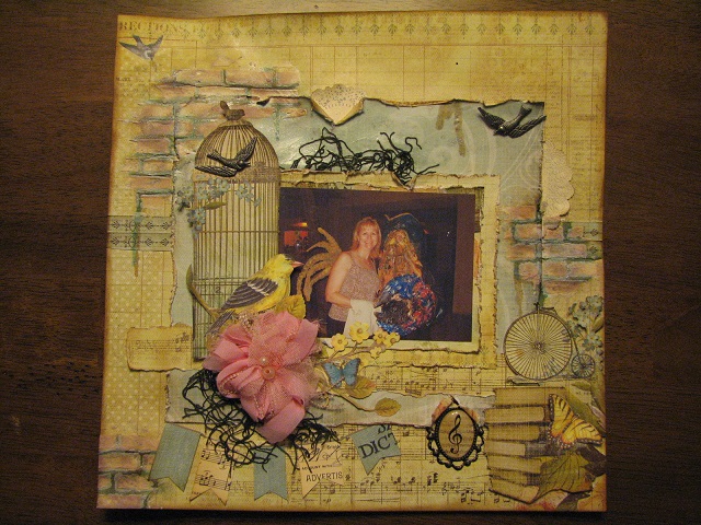
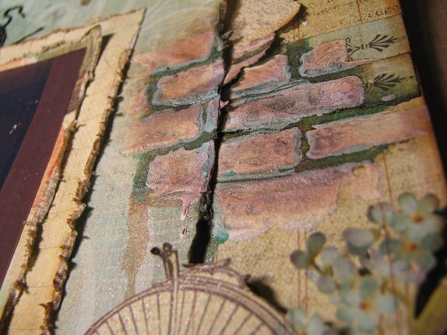
I did a lot of fussy cutting, layers of paper, added some home-made texture paste, some sprays, ink…..yup, it’s done!  I love how the bricks turned out.  The stencil I made up myself on my Cricut and it worked perfect!  I used some of my new Lindy’s Stamp Gang sprays I just got….Limor’s Industrial Chic set which is sooooo amazing!  The colors are fantastic and I’m loving this set!  At first I’d left the bricks white and then took my Shabby Turbine Teal Starburst spray lid, and with just the tube from the spray bottle I traced around each brick to simulate the grout.  Although I loved the color I wasn’t so loving the look I ended up with.  So I thought, I need to darken up the bricks or something, so I grabbed the Steel Shimmer Glitz Spritz and gave the bricks a couple of shots/layers of that spray,  Although it did bring out the texture within the bricks, there was still something I didn’t like.  This is where Limor came in…..just take some Tim Holtz ink and grunge up the bricks….it’s the white that’s throwing you off.  Ding, ding, ding…..yup.  Out came the Vintage Photo ink pad (my go to stamp pad) and I grunged  up the bricks, the edges of the paper layers and the whole edge of the page.  What a difference it made!!  I still wasn’t loving the teal grout look, so I took the Steampunk Sepia tube and traced over the teal and love how the bricks turned out!!  The little bit of shimmer and shading on the bricks is still visible even after the ink was blended in and just adds to the depth of the bricks.  Check them out!!


So, with the help of two of my friends, I cranked out my first layered, mixed media layout and Let It Go.  You two ladies rock…..I continue to grow as an artist because of your influence and I can’t thank each of you enough.  You both come to the table each week and share your very different styles and challenge me to step out of my comfort zone and just create…..and purge my crafting stuff……..mercilessly.   Huggss to you both!  Mwahhh!  Click on the links to check out their pages!


IMG_2329 IMG_2328


Facebook:  Mixed Media Monday’s with Tracy Weinzapfel

Limor1278 Mixed Media Art Group

Blogs:  Limor Webber Designs

Tracy Weinzapfel Studios

Once again, thank you to those who read through my ramblings sometimes. I do sooo appreciate each of you, truly I do.

Huggss,

Yvonne